
Portolan Charts – Navigating the Ancient Seas
Portolan charts were navigational maps designed to help sailors get safely to and from different places. The term derives from the Italian portolano meaning a collection of sailing directions. The first chart appeared in Italy during the 13th century, about the same time as the use of the magnetic compass, and countries such as Spain and Portugal began making their own shortly after. This new design of mapmaking meant that seafarers were now able to actively visualize Europe instead of just moving blindly from one point to another.
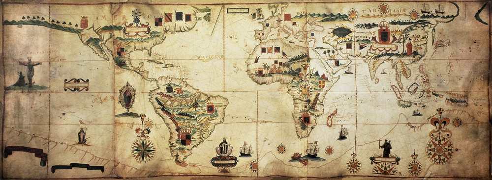 The portolan charts were about the size of a small coffee table and the first ones were accurate representations of the areas around the Mediterranean and Black Seas. They were designed using a network of lines in a circle, called rhumb lines, which showed the 16 directions of the compass. These were the maps skeleton, and created a foundation for the other details that were included. The maps illustrated specific coastal features, such as reefs and coastal islands, ports and their names, as well as the shapes of coves that the ships wouldn’t be able to enter. This was all valuable information to the crews when they needed to get to shore (to repair any damage or avoid dangers on the ocean).
 In the 15th and 16th centuries the charts were cartographically accurate, and they paved the way for the Age of Discovery and Exploration. With sailors exploring the seas further away, mapmakers could begin to create charts that showed areas as far as the African coast and the New World, based on the accounts that they brought back with them. The Age of Discovery was the same reason that their use declined, as topographers learned new ways of designing maps.
One of the major problems that mapmakers have, even today, is the fact that the earth is spherical while maps are flat, and they have to compromise and use various techniques in order to get a curved surface accurately represented on a flat one. Portolan charts showed how cartographers of the era were able to overcome this problem, as the maps are almost as accurate as the ones that we currently use. Mathematical skill was very influential in the way that they were created and the mapmakers capturing so many details using just the accounts of sailors was extremely unbelievable.
The oldest portolan chart that has been securely preserved can be found in the Library of Congress and has been dated between 1290 and 1350. There are very few that have survived to this century, and we can appreciate the remarkable feat accomplished in how these maps paved the way for discovery and expansion to mold the world in which we live in today.


Always so educational!
LikeLike
Very cool!
LikeLike
excellent reading
LikeLike
Thanks Jelle – glad you enjoyed it.
LikeLike